Page 1 of 1
Re-typeset parts for legibility
Posted: Mon Feb 16, 2026 1:00 pm
by wtw
Hello,
I am playing the
Crusell Clarinet Quartet No 2 and found that the
separately scanned parts (i.e. those published by Richault) were quite hard to read. I therefore typed them into the computer to create clean copies. These are (as best as I can make them) true to the parts already online (so I haven't fixed any wrong notes or dynamics conflicting between parts, but may have made errors). I think they generally comply with the typsetting guidelines
https://imslp.org/wiki/IMSLP:Typesetting_Guidelines.
Question - would it be useful to submit these parts?
Caveat - I didn't spot the much clearer photographs of the later edition also available, mostly because I'm a bit silly, but also because these have all 4 parts in 1 file and it took up much less screen space, so I missed it.
Sorry if I've missed some guidance somewhere - it didn't feel like a new version, nor an arrangement into another form.
Thanks,
Will
Re: Re-typeset parts for legibility
Posted: Mon Feb 16, 2026 1:09 pm
by ScoreUpdater
Yes, we at IMSLP would always gladly appreciate any new typesets that contributors like you are willing to share with the wider community.
To do this, please follow the instructions
here.
Many thanks,
Re: Re-typeset parts for legibility
Posted: Mon Feb 16, 2026 3:42 pm
by coulonnus
And I'll be happy to proofread it. I'm aware of typesetters' problems

Do you plan to provide a
complete score too? This is always useful.
Re: Re-typeset parts for legibility
Posted: Mon Feb 16, 2026 3:54 pm
by coulonnus
Note that there are several scores and parts on the market. Will yours be better?
Re: Re-typeset parts for legibility
Posted: Mon Feb 16, 2026 4:36 pm
by wtw
Parts and score are currently available at
https://github.com/WillTWinter/CrusellC ... 2/releases. I'll wait until we've played through, and then see about submitting it. (edit: release url now points at the fixed url, not the one which changes. Sorry.)
Better? I'm not sure - I would expect anything professionally published to have more experience and capability behind it than I have. However it is easier to print/play from than what is presently available.
Opportunities for improvement - I'm fairly convinced there are some errant accidentals, phrasing marks and dynamics in both the versions online. I was waiting until I had actually played it through before being as bold as to change anything.
Re: Re-typeset parts for legibility
Posted: Tue Feb 17, 2026 8:30 am
by coulonnus
I'm printing the material and will start the job soon, but Sibley-Rochester had accustomed us to better scans!
Re: Re-typeset parts for legibility
Posted: Tue Feb 17, 2026 3:14 pm
by coulonnus
I have proofread only Clarinet and Violin so far. Of course many slurs, beam etc. would not be the same with me. I'l try to limit myself.
Clarinet, Pastorale: Only 1 l required in the title. Meas 57, 1st note: It is usual to add an unnecessary courtesy natural.
Violin, Allegro, meas. 55: please reproduce the courtesy F natural and E flat of the source.
meas. 85, the first E 16th note wants a staccato dot.
Otherwise everything is perfect. Congratulations!
Generally scores are typeset with an engraving size smaller than parts, providing 4 systems/page.
Will you add a cover page to your parts? At present if you print them in booklet mode the good page turns will be at the bottom of even pages.
Re: Re-typeset parts for legibility
Posted: Tue Feb 17, 2026 4:58 pm
by coulonnus
Viola part: (the first "real" misprints so far
)
Allegro molto...
meas 30: want a courtesy D natural.
meas 97-99 want a E natural.
Last Allegro:
Review end of meas. 90.
Re: Re-typeset parts for legibility
Posted: Tue Feb 17, 2026 5:38 pm
by coulonnus
Cello part:
meas. 21: move the accent of meas. 22 backwards.
meas. 35 add a courtesy B flat.
Re: Re-typeset parts for legibility
Posted: Wed Feb 18, 2026 5:28 pm
by wtw
Thank you - you are correct on every one of those mistakes. The updated versions are available as the latest release from the same url as above.
I'm not sure I fully understand courtesy accidentals, though when playing I often find them very useful. Is there a reason that there isn't one in the viola part 1st movement bar 104 on the E flat (lower note in the chord on the 3rd crotchet of the bar)?
Cover pages - I've inserted a page break between the title and the first staff in the two parts (violin, viola) where the page turns require the music to start on an even page. This looks clunky, and I'll try to tidy it up later, but it should at least print correctly now. I haven't put one on the other parts, because I'd have to insert 2 pages to get the music to start on an odd numbered sheet.
We've got a rehearsal scheduled in for tomorrow - I'll see what else this uncovers, though as I've practiced some of the mistakes you spotted and not noticed them it's possible this won't be that revealing. Apparently my fingers can correct an E flat to E natural without notifying my brain.
Re: Re-typeset parts for legibility
Posted: Wed Feb 18, 2026 6:19 pm
by coulonnus
wtw wrote: ↑Wed Feb 18, 2026 5:28 pm
I'm not sure I fully understand courtesy accidentals, though when playing I often find them very useful. Is there a reason that there isn't one in the viola part 1st movement bar 104 on the E flat (lower note in the chord on the 3rd crotchet of the bar)?
yeah, there is a natural bar 102. When it's at the previous bar a courtesy accidental is needed but for a bigger "distance" our opinions may vary
Re: Re-typeset parts for legibility
Posted: Wed Feb 18, 2026 6:31 pm
by coulonnus
Now the page turns are OK. If I may still bother you:
1: The very short slur between an appogiatura and the next note should not collide with the stem of this note, if you can shorten it a little.
2: beams of 16th notes should not come closer than 1.5 inter-staffline to either note. Often there is only 1 inter-staffline.
Check good editons like Peters or Henle. Hope Lilypond offers this option.
Re: Re-typeset parts for legibility
Posted: Thu Feb 19, 2026 12:30 pm
by wtw
I think I can do something about both, but I'm going to have to do a bit more reading to make sure I don't break anything else in the process. To check that I'm on the correct lines...
1: The very short slur between an appogiatura and the next note should not collide with the stem of this note, if you can shorten it a little.
In the following attachment, A is what I presently have, with the slur crossing the stem. B is what I think the correct output should be, though there are options for exactly how you shorten the note. I slightly prefer the first one. C I think I've seen, but it looks horrible to my eye, and D, while it's quite neat on the page, I'm not sure I've come across grace notes with the stem going down. So, unless there are good reasons otherwise, I'll aim for something like B
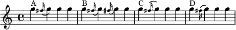
- test_grace_slurs.cropped.png (6.65 KiB) Viewed 216103 times
2: beams of 16th notes should not come closer than 1.5 inter-staffline to either note
Actually, lilypond does offer this option. Again, I need to do some reading to work out what the units are, and how this will change between the score and the parts, but I can do something like this:
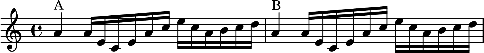
- test_stem_lengths.cropped.png (16.3 KiB) Viewed 216103 times
(Again, A is the original, in B I've just added a little extra length to stems for 16 notes, by eye, just about 1.5 staff spaces)
I'm learning parts of lilypond I never knew existed. I'll do the reading and post again once I've updated the parts.
Re: Re-typeset parts for legibility
Posted: Fri Feb 20, 2026 6:52 am
by coulonnus
wtw wrote: ↑Thu Feb 19, 2026 12:30 pm
In the following attachment, A is what I presently have, with the slur crossing the stem. B is what I think the correct output should be, though there are options for exactly how you shorten the note. I slightly prefer the first one. C I think I've seen, but it looks horrible to my eye, and D, while it's quite neat on the page, I'm not sure I've come across grace notes with the stem going down. So, unless there are good reasons otherwise, I'll aim for something like B
test_grace_slurs.cropped.png
B is perfect.
wtw wrote: ↑Thu Feb 19, 2026 12:30 pm
2: beams of 16th notes should not come closer than 1.5 inter-staffline to either note
(Again, A is the original, in B I've just added a little extra length to stems for 16 notes, by eye, just about 1.5 staff spaces)
Perfect.
Re: Re-typeset parts for legibility
Posted: Fri Feb 20, 2026 8:40 pm
by wtw
Thank you - I've rolled those changes through the parts and released again.